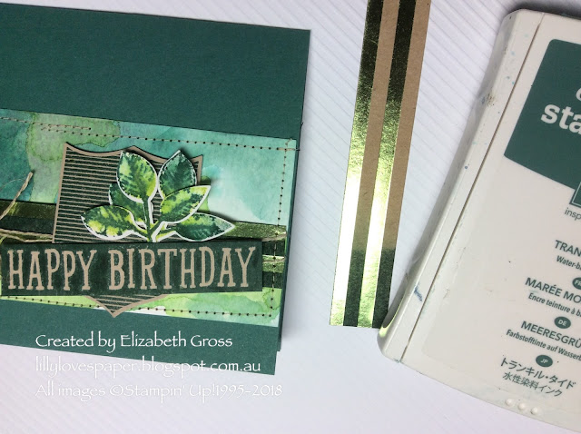
Hi there, today I wanted to share a quick tip with using the Foil Frenzy Specialty DSP(144125). This is a heavy weigth kraft card with foil designs printed on the paper - random spots, stripes and a chevron pattern. You get 4 colours in the pack - Lemon Lime Twist, Berry Burst, Tangerine Tango and Soft Sky. I love the kraft card but did you know you can sponge and stamp on the card to change the kraft colour? too easy and such a great effect.
I am not a huge fan of Lemon Lime Twist (I know, I'm in a minority) but I wanted to participate in the Just Add Ink challenge and my friend Lou Kitzelman on the design team commented on one of my other posts that she hoped I would come to love this colour so I have given it another shot!! I don't love it on its own but it is quite gorgeous combined with Tranquil Tide, so I have watercoloured a strip using both, and stamped the leaves from Painted Harvest using both and then I took a strip of the Foil DSP and whacked the inkpad down to add a heavy layer of tranquil tide. once you wipe away the excess you have the benefit of the resist technique and the ink changes only the kraft card.
I love the sketch layout from Global Design Project so that was a good direction to follow to construct this card.
You can see the effect more clearly on this sample strip where the ink starts and finishes.
It's a bit hard to get the effect in a photo so here's a different angle.

Here's the shiny foil from a different angle.
I hope you have a creative week and remember,
"don't just post online,
post something pretty!"
cheers, Liz


Oh Liz! This is absolutely stunning - so many little bits and pieces all coming together for one gorgeous card! I love the colours on your watercoloured background and colouring the Foil Frenzy DSP is a stroke genius - an idea I definitely need to nick .... if I may! PS Love how you have shown LLT some love!
ReplyDeleteLemon Lime Twist not my favorite either but you did a magnificent job of incorporating it into beautiful cards. Thanks for the inspiration.
ReplyDeleteI just love how you used the greens as the primary colours Liz. There is so much depth of colour especially when you add in some lovely watercoloring! Thanks for joining us at Just Add Ink this week.
ReplyDeleteThese are both gorgeous cards Liz. I love your water coloured panel on the first card and all the details you've added to add depth and texture. And your colouring of the Kraft card stock really is so clever and makes a perfect background to the dots on your balloon card too. Thanks for sharing with us at Just Add Ink this week.
ReplyDeleteOh awesome! I totally adore this card and the perfect layering you've done! That watercoloured background is a standout too! Thanks for joining us at JAI this week!
ReplyDeleteOhhh I really love the way you have used the colours and created the watercolour panel. Chantell Just Add Ink
ReplyDelete