Welcome back to the next blog hop for colour INKspiration.
I just love the colours this week - and my gorgeous daughter is a redhead so the inspiration picture really spoke to me. I rarely use Cajun Craze ( have you read that in 95% of the posts this week?) but it is quite a beautiful colour when you give it some love! AND how well does it go with these colours. Bronwyn has done a brilliant job of challenging us all this week. I hope you get a chance to get inky and play with them too.


I just love the colours this week - and my gorgeous daughter is a redhead so the inspiration picture really spoke to me. I rarely use Cajun Craze ( have you read that in 95% of the posts this week?) but it is quite a beautiful colour when you give it some love! AND how well does it go with these colours. Bronwyn has done a brilliant job of challenging us all this week. I hope you get a chance to get inky and play with them too.

Do you ever look at a challenge and wonder where to start?
This often happens to me so I regularly turn to a trusted sauce of Inspiration - The Annual Catalogue. I figure the concept artists and designers there have already done a lot of hard work in experimenting with projects to come up with the right balance of scale, embellishments and layout so when I have limited time I can take short cuts by copying their ideas.
When I first was introduced to Stampin' Up! the catalogue was actually called an Ideas Book.
I can't show you pictures of the inside of the new catalogue yet (not until June1) but I was impressed by a project on page 150 and immediately new I would be CASEing it at some point. It uses the emboss resist technique and some pastel colours but I thought the design could take the strength of this colour combination.

there are a few differences - some of them subtle - which I was experimenting with
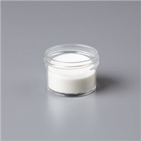
- one uses clear embossing powder for one layer of the leaves, the other uses white powder
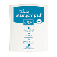
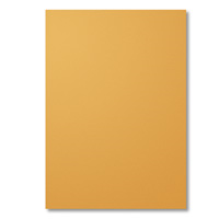
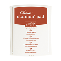
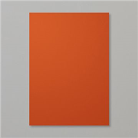
- one uses Delightful Dijon for the mat, the other uses Cajun Craze
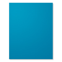
- one uses Delightful Dijon for the base, the other uses Island Indigo (seriously a gorgeous colour!)
- The text on one is tone on tone, on the other it's contrasting
I'm always fascinated by how changing a few elements while keeping the others the same can completely transform a card. Changing the backdrop for the same feature panel changes the look quite dramatically. Which do you like better?


I did use up a few old embellishments on these- the Dijon resin flower and the Regals Button (obviously justifies my policy of hoarding until "one day when you need it).
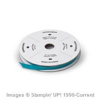
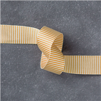
I will really miss that Dijon mini striped ribbon.
I have split the words on the sentiment so that only one word is on the front,
and of course the inside is decorated.

HANDY TIP: Did you know you can recolour your DSP if White is not the accent you need? This shows the difference when I have simply sponged some Dijon over the white text to completely alter the look. Crumb Cake also works really well for this and I do it quite often.

If you too would like to use the Catalogue for inspiration -
or follow a group of stampers who do that every week-
then check out the CASEing the Catty Facebook page and Weekly Sunday night hop.
We focus on a different section of the Catalogue each week
and just like this fabulous CI format you are very welcome to participate each week on Facebook.
(You'll already know a lot of the CTC team because
they are designers here on the Colour INKspiration team too)
Next this week is Kim. I'm so excited to see what everyone creates with this striking combination.
Don't forget to Click on the banner below to go to the Colour INKspiration Facebook page where you can add a picture of your creation using these colours.
Thanks for looking today and remember
"don't just post online,
post something pretty!"
Liz

Awesome card fold and thanks for the tip with colouring the white accents x
ReplyDeleteBeautiful cards Elizabeth! Love the project you have cased too! How clever with the DSP - I have never thought of that! Thank you for the tip :-)
ReplyDeleteWow!!! Amazing cards Liz. Love the 'glow' of the trees, such an awesome effect! Great design tips too. Kelly x
ReplyDeleteI love that you coloured your dsp it makes it more versatile. I also love your fancy fold on your card too x
ReplyDeleteBoth are great cards Elizabeth but if you are going to make me pick I think I lean towards the swing. Thanks so much for the tip with DSP and changing the colour to suit!
ReplyDeleteLove love love it. And my favourite is the island indigo base card! Love your fancy fold too!
ReplyDeleteBoth gorgeous cards, but I've finally decided I prefer the one with the swing. That might be because I gravitate to blues though.
ReplyDeleteWow Elizabeth, your card is amazing! Love Ve this. I never thing to colour DSP... Must try that!
ReplyDeleteSuperb Liz. Thanks for including so many tips. You always have something to teach me! Plus - I have thought of myself as a Cajun Craze head but will now!
ReplyDeleteBoth of these are lovely Liz! I had to go peek at my catty to see which one you referenced..:0) Fab tip on the dsp, cant say l have ever thought to do that. xx
ReplyDeleteI love the intensity of colour Liz, the dark halo around your tree really makes it pop! I think I'd go with the Indigo card base as my favourite.
ReplyDelete