Welcome back for another round of Colour INKspiration.

The groovy photo #12 for inspiration this week has so many elements- texture, stitching, loads of colour, geometric patterns,stripes sheep, trees, waves, balls, timber....it was too much for me initially.
I love all the elements but having to choose a few was hard for me. .. or even a starting point!

So I have been avoiding trying to create from this picture until tonight when I went for a long walk and the gorgeous sunset colours spoke to me.
Deep blue and purple at the horizon, golden peach at the lower end of the sky, reflecting off the buildings with a beautiful glow, stretching up to gentle pink and a soft blue at the "top" of the sky. I knew then what colours I would use.
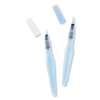
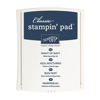
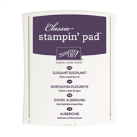
I took a panel of shimmery white card and wet it with my aquapainter then painted stripes of the navy and eggplant and let the water move the ink around. Drying each band of colour before adding the next meant that I didn't end up with a dirty brown mess. I also didn't blot off any of the water, so the heat gun moved the little driplets of water around until the moisture evaporated and the trails of colour were left on the card. I didn't add in dapper denim but kept to the navy and eggplant.
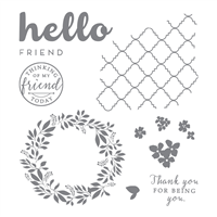
Then it was a simple matter of stamping over the watercolour. I am not traditionally a "purple person" so Navy seemed perfect for the sentiments and card base. The Hello Friend set is so lovely and has both texture and image elements so I had a bit of fun using the stamps and trying to stamp each colour only on itself.
I added some embossing paste which I coloured just by using my "sponged mask embossing technique"sponging method- it's so clean and there's no wastage of paste - and you can achieve a lot paler intensity of colour. I have more details on this technique here and here.
And how could I not add some stitching? It's right there in the photo!

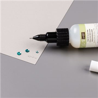
When it was all together it still lacked something so I simply used the fine tip glue pen to colour over the flowers and "hello". It dries glossy and adds a beautiful shine. I also coloured the little flower trios and popped a teeny pearl in the centre of each to set within the glue.
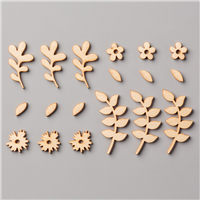
Finally I took one of the gorgeous timber Touches of Nature elements and coloured the white side then wiped off the ink to get a subtle look. ( one side is natural look and the other is white which you can easily colour). My only problem with these is that I have misplaced the rest of the precious packet. Guess I need to tidy up my craft space.... someday....
These too got the fine tip glue treatment.


Next this week is Mel and her beautiful project. Enjoy!

Thanks so much for looking this week, I hope you enjoy all the entries on the hop! And I hope you feel inspired to create your own project and link it to our Facebook group.
"don't just post online
post something pretty!"
Liz

Oh, wow, Liz - this is glorious! Love it to bits.
ReplyDeleteThanks Christine
DeleteLove the texture and watercolour effects on this card Liz x
ReplyDeleteThanks Nicole, I'm a sucker for watercolour!
DeleteHow cool is that background Liz! And the fine tip glue really does add that special touch. Thanks also for drawing my attention to another stamp set I hadn't really noticed yet (sighs and adds to basket!)
ReplyDeleteSOrry about that Mel, yes it's a nuisance when that happens! Happens to me and my never ending basket of wishes!
DeleteSo many gorgeous elements in one stunning card Liz! And the gloss from the fine tip glue pen - just takes it to a whole other level!
ReplyDeleteThanks Lou, and I didn't even smudge the glue- this time lol. Gotta love a simple treatment with a big wow factor.
DeleteJust a gorgeous watercolour background Liz! I love the colour transitions and how you layered it with tone on tone flowers and the subtle paste patterns.
ReplyDeleteTexture texture texture .... oh my this is just amazing Liz!
ReplyDeleteStunning. Love love love. Glorious. Divine. I want to craft like you when I grow up!!
ReplyDeleteGorgeous card Liz - I love the styling and beautiful embellishments! Kelly x
ReplyDeleteLove all the texture and colour on your card - very arty.
ReplyDelete