Partial die cut technique for Words - a photo tutorial (finally)


Some time ago I posted some photos of a few cards die cut with the great Little Letters Framelits so that the word stands up when the card is folded.
See Little Letters Thinlits, Love, Love, Love these (from July23).
It's a great effect and I was asked to create tutorial to explain it.
So Jacqueline I apologise for the delay but I have finally found some time to put this photo tutorial together. (I couldn't even contemplate creating a video).It is a picture -heavy post and I hope it is easy to understand, any questions please email me.

These are a few Christmas notecards that I had fun playing with  (they will be cute table place cards)


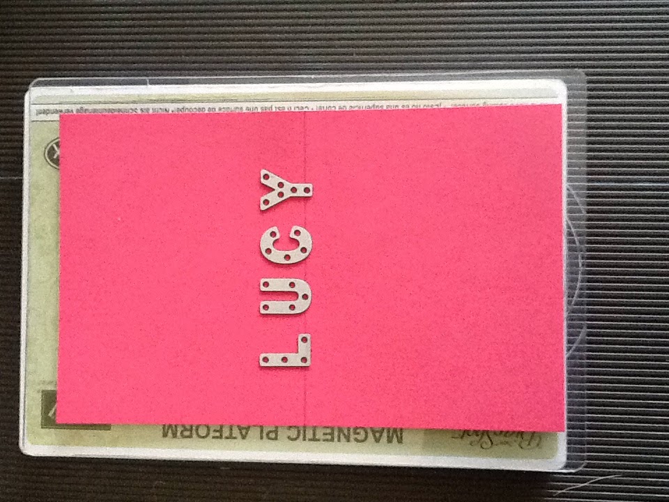
Begin by ruling a pencil line along the centre fold of your card base. Place the lower big shot plate on the cutting platform. Put the cardstock on the plate and then arrange the letters cutting side down with the base of the letter approx 3mm below the pencil line. Use a ruler or straight edge of cardboard to make sure they are in a straight line. The Magnetic platform for the Bigshot is a huge advantage for this technique.


Take a piece of Washi tape and remove some of the "sticky"ness by sticking it to some fabric a few times first (the leg of your jeans for example). Then place the 'not so sticky' washi tape over the letters to secure them in place. Have the straight edge of the tape running along the pencil line.

Layer the sandwich by placing the top big shot plate with the edge along the edge of the washi tape. This way when you run it through the big shot only the top part of the letter will be cut -the 3mm below the pencil line will remain intact.
edge of the top plate along the edge washi tape but not completely over the letters before running it through the big shot
Gently peel back the washi tape and remove the letters. It may be necessary to gently push out the cardstock letters using the small end of a scoring stylus. (a paper piercing tool will damage the cardstock)


Gently score the centre fold along the scoreline between the letters, do this from the front first so you can clearly see where to start and stop between letters. Then turn it over to the inside and score it  properly on the inside.(be careful not to go through the letters)
Inside before you score it, the letters are partially cut but the base of each letter is intact.
this has been scored from the front, now you need to reverse the score so that it fold the right way.

 Gently fold the card and stand the letters up. Then you are free to decorate as desired.
This si a birthday card for a 5 year old!
Folded so the letters are standing, ready to decorate.

View from reverse, letters may need a little gentle straightening with your bone folder

Just needs the number 5

With a matching envelope made to fit.

As I said in my earlier post (July23) It is a bit fiddly a probably not suited to a class unless they are very small classes and very proficient card makers. The letters are small and easy to lose and it is a bit fiddly, but I still think it is well worth the effort.
If you do make some of these I would love to see you creations, and I would love it if you could link your cards back to this blog.
cheers,
Hope that helps, Liz


Comments

  1. Fabulous tutorial and project; TFS! :) Donna (SC)

    ReplyDelete
    Replies
    1. thanks so much Donna, glad you liked it, hope you are inspired to go ahead and make some too!

      Delete

Post a Comment

Thanks so much for taking the time to comment. I really appreciate it,
In line with new Data Protection legislation (GDPR) by commenting you do so in the knowledge that your name & comment are visible to all who visit this blog and thereby consent to the use of that personal information for that specific purpose.
Liz

Popular posts from this blog

New In colour 2025-2027 cards and the FABULOUS Extraordinary Flora Washi Tape.

Don't you love it when a single product creates enough elements to decorate a bunch of cards at one time? The Extraordinary Flora Washi tape is one of those products. I created these for my upcoming Catalogue Launch. I put the Washi onto Basic Beige to cut these flowers and love how it coordinates with the Basic Beige card base. To create these cards I trimmed 2.5cm from the front edge and adhered a 3.5cm strip of DSP to the inside of the card to give an added layer. These were easy to put together. Darling Duckling Secret Sea Strawberry Slush Timid Tiger Cloud Clover June 3 - 30 Stampin Up has an amazing offer where you can get 50% off any second product from a suite. So for example if you were to purchase the Extraordinary Flora Die you would be able to buy the tape at 50% off. Please reach out if you want more information on this great deal. You can see all the available suites in my online store. I am loving all the new colours.  I hope you have a creative week and remember,...

GDP #277 a gorgeous colour combination with Pretty Perennials

The Pretty Perennials Stampset is gorgeous to use on its own but the floral dies really do add a little something special. My card this week matches the colour challenge at the Global Design Project. I have stamped directly onto the Oh so Ombre DSP which is a free Sale A Bration item with a qualifying purchase for the rest of this month. I love the tone on tone stamping for added depth. I have gone over the Happy with Wink of Stella but it's not easy to photograph. The teeny heart is a teeny leftover of some retired Blushing Bride Glimmer paper and I have also incorporated other retired embellishments like the library clip and crystal button - I do love to use them up. Pink and florals - a perfect match. Here's what I used. Product List Pretty Perennials Photopolymer Stamp Set [ 154435 ] $31.00 Pretty Perennials Bundle [ 156234 ] $78.25 Oh So Ombre 6" X 6" (15.2 X 15.2 Cm) Designer Series Paper [ 155225 ] $0.00 Roco...

CTC#48 Who doesn't love new DSP

Welcome back to CASEing the Catty for this round. You may have come from Rachel's beautiful project  or you maybe starting here. There are lots of great posts to visit. This week we are using new Designer Series paper from the Holiday Catalogue - and who doesn't love a pack of new paper? The problem of course is which one to choose.... followed by the problem of actually having to CUT into a pristine pack. ....I know you all know what I mean. I have lots of photos for you today to try and show off some of the designs, but it's not easy to capture and they always look so much better in real life. I have purchased two packs - the Happy Haunting pack on page 47, which I was inspired to get purely from the background piece on the Lighthearted Leaves card on page 44. I don't celebrate Halloween, nor am I usually all that partial to Orange shades, but maybe that's changing! because I really like the designs. The pack has several papers that are specifically...