CI08 Playing with Gold

Welcome back to Colour INKspiration this week.We're a bit out of sync lately having had the changes to timetables with Easter and Anzac Day. So it's good to get back into the swing of things. 

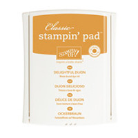
This week's inspiration picture is just so gorgeous but browns are not a colour palette many of us use routinely as a base so I found it hard to get started for this project.  I began with some clear block "smooshing" using delightful Dijon and Shimmer Paper which created a nice panel to use for the accents and sentiment. I did actually stamp the butterflies and heat emboss them with clear powder but that doesn't show up very well in the photography.

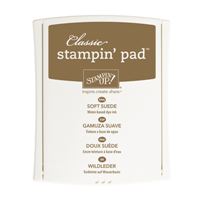
Then I used my favourite leaf image from Kinda Eclectic and created a full sheet of background card stamping with soft Suede onto Tip Top Taupe. I'm really sad that this set is retiring - but i don;t think it will leave my shelves!!
 I loved the panel but wanted to accentuate with some gold highlights so I stamped the miniature butterflies from the Perpetual Calendar set over and among the leaves and heat embossed them with gold too. The frame is obviously gold, and I heat embossed the sunrays onto vellum in gold also.


Here's a little bit more detail


And the inside is decorated with a few strips of paper and card.


I had lots of scraps left over and they sort of just fell together for another Mother's Day card to add to my market stall next week.


Thanks for looking today, the beautiful Jacque is up next with her lovely soft style. The range of projects produced this week is stunning. Enjoy your tour of the hop, and be sure to leave some comments as we all really appreciate your feedback.


and remember, 
"don't just post online - 
post something pretty"

Sarah Douglas challenged us all at Onstage to "post something that means something - 

I think she's on to something.

cheers, Liz


Comments

  1. Wow, your cards are amazing and so detailed and beautiful and gorgeous. I really love the Mother's Day card too. The smooshing looks so soft and pretty.

    ReplyDelete
    Replies
    1. Thanks Julia, smooshing is one of my favourite techniques!!!

      Delete
  2. Wow, 2 amazing cards Liz! Love the texture & design in the Kinda Eclectic card - it suits the theme perfectly! Kelly x

    ReplyDelete
  3. Oh my, both cards are gorgeous! You have done an amazing job with this colour challenge TFS xxx

    ReplyDelete
  4. You have made the tones of browns look so pretty!! They are stunning!! Love love love them xx

    ReplyDelete
  5. Wow! What a stunning card Elizabeth! I am loving all those layers! You have worked those colours perfectly!

    ReplyDelete
  6. Liz, I can't begin to tell you all the things I love about your cards. I love the kinda eclectic leaves, love the new shiny embellishments, and the inside of the card etc etc.

    ReplyDelete
  7. Love those layers! I really struggle to get balance like this ... everything just works sooooo beautifully! T

    ReplyDelete
  8. Wow, these are both lovely Liz. The addition of gold accents really adds that something special.

    ReplyDelete
  9. Love them both Liz! The smooshing makes them!

    ReplyDelete
  10. Oh wow, looks stunning. Love the gold!

    ReplyDelete
  11. Liz your cards are so lovely, I had missed the little butterflies on the background of the first card.

    ReplyDelete
  12. Absolutely stunning, Elizabeth. The gold accents give life to both of your beautiful projects. D xox

    ReplyDelete
  13. Two gorgeous creations Liz! I love the gold details and the collage style...really beautiful!xx

    ReplyDelete
  14. Two gorgeous cards, Liz. Love how you used the 'scraps' for the second one and it's a stunner too. Great idea to do Mother's Day cards with an Autumn theme - makes perfect sense!

    ReplyDelete

Post a Comment

Thanks so much for taking the time to comment. I really appreciate it,
In line with new Data Protection legislation (GDPR) by commenting you do so in the knowledge that your name & comment are visible to all who visit this blog and thereby consent to the use of that personal information for that specific purpose.
Liz

Popular posts from this blog

GDP #277 a gorgeous colour combination with Pretty Perennials

The Pretty Perennials Stampset is gorgeous to use on its own but the floral dies really do add a little something special. My card this week matches the colour challenge at the Global Design Project. I have stamped directly onto the Oh so Ombre DSP which is a free Sale A Bration item with a qualifying purchase for the rest of this month. I love the tone on tone stamping for added depth. I have gone over the Happy with Wink of Stella but it's not easy to photograph. The teeny heart is a teeny leftover of some retired Blushing Bride Glimmer paper and I have also incorporated other retired embellishments like the library clip and crystal button - I do love to use them up. Pink and florals - a perfect match. Here's what I used. Product List Pretty Perennials Photopolymer Stamp Set [ 154435 ] $31.00 Pretty Perennials Bundle [ 156234 ] $78.25 Oh So Ombre 6" X 6" (15.2 X 15.2 Cm) Designer Series Paper [ 155225 ] $0.00 Roco...

New In colour 2025-2027 cards and the FABULOUS Extraordinary Flora Washi Tape.

Don't you love it when a single product creates enough elements to decorate a bunch of cards at one time? The Extraordinary Flora Washi tape is one of those products. I created these for my upcoming Catalogue Launch. I put the Washi onto Basic Beige to cut these flowers and love how it coordinates with the Basic Beige card base. To create these cards I trimmed 2.5cm from the front edge and adhered a 3.5cm strip of DSP to the inside of the card to give an added layer. These were easy to put together. Darling Duckling Secret Sea Strawberry Slush Timid Tiger Cloud Clover June 3 - 30 Stampin Up has an amazing offer where you can get 50% off any second product from a suite. So for example if you were to purchase the Extraordinary Flora Die you would be able to buy the tape at 50% off. Please reach out if you want more information on this great deal. You can see all the available suites in my online store. I am loving all the new colours.  I hope you have a creative week and remember,...

Colour INKspiration #11, lovely colour combo

I've had a bit of fun this morning playing with a fe new products. I LOVE the new embossing paste- and I've been waiting for ages for SU to bring out some materials for mixed media.  This paste is light and very easy to spread it dries quickly and gives a beautiful finish It can be easily coloured with our refill inks to create a perfect match. This weeks colours are just lovely together.  In my card I have used marina mist ink to colour the paste and used the brick wall mask. This is spread over a watercolour wash using Marina Mist- I just love the layers of colour. To create the leaves I used the 3 ink colours from the challenge and the baby wipe technique to get the variegated leaves using the Colorful Seasons stamp set and framelits. I don't currently have any Early Espresso cardstock but I do have some very old (retired) Early Espresso heat emboss powder, and I have used this for the sentiment on vellum. Of course I ended up with ...