HELLO
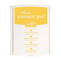
and welcome back for another round of Colour INKspiration, where this week we have a bright sunny yellow palette. I had lots of ideas on what to create with this set but had trouble getting most of them to come together.
In the end I created a floral card with some triangle elements and several layers.
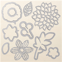
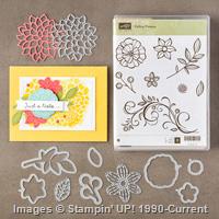
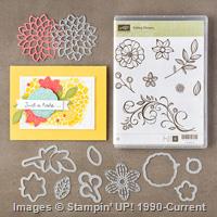
I love the Falling Flowers suite for heat embossing and colouring.
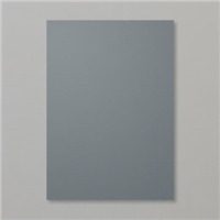
All the floral elements are heat embossed with white on white then coloured using the markers or a blender pen and markers. I have cut the centre from one of the flowers and raised it up. The accent around the triangle flap is actually silver foil and then Smoky Slate DSP which doesn't show up very well in this photo.
I love the dark tone of the DSP (from the retired Urban Underground DSP) which sits on a separate hinged flap under the first layer. Hopefully the photos will give you a clearer idea.

The front - still doesn't show the silver between the white and the Smoky Slate.
When you lift the white flap this is the first layer.
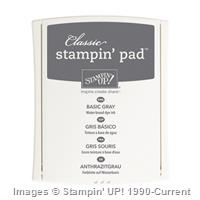
The angled piece of Smoky Slate marble DSP is just a cover to hide the mess under the flap and also to provide the Slate edge visible from the front. I used a second larger piece of this paper as the inside of the card where you write your message, the top 2cm of this is the hinge flap which holds the Basic Gray piece in place.
That strip of daffodil DSP and thin gray washi hide the hinge.
I really like the blossom cut in half and adhered to the edges- it sort of keeps the floral theme flowing through without taking over the page.
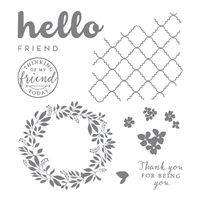
I'm loving the Hello Friend set at the moment and have recently done some Christmas cards with it.
There wasn't really a pattern to this Fancy Fold, I just built it as I went!
When you lift the "Hello" page this is the final inside
Perhaps the side view will give you a better appreciation of the construction.
Thanks so much for looking, I hope you have a sunny day wherever you are.
Do show us what you can create using the same colours. You have 2 weeks to get a card or other project made and then post a photo to our Facebook page- it's that easy. We love to see how the colour inspire you.
Next on the hop this week is Cathy Pinchbeck, you're going to love her graduated colours.
Have a creative week!
Thanks for looking, and remember
"don't just post online,
post something pretty!"
Liz


We really can see the silver foil and the contrast in those greys is gorgeous.I'm glad I have a little bit of Urban Underground DSP left.
ReplyDeleteThanks Rachel, yes I loved that paper.
DeleteLove the design Liz! The angled panel is such an effective idea. xx
ReplyDeleteThanks Nikki, I've been wanting to try it for a while. Good thing about challenges, gets you doing stuff!!
DeleteI love your fancy fold! I love the angled flap on the front. This is a brilliant element from the challenge picture. Awesome card and so beautifully put together.
ReplyDeleteThanks Julia, took me a while to translate ideas to reality but I was happy with the final result.
DeleteSuch a lovely card Liz, so many elements to it.
ReplyDeleteNow that is so cool Liz. Love every part of it - from the triangle details to the flap - superb!
ReplyDeleteThis is such an innovative card front, Elizabeth. I love your creation with the Challenge colours. D xox
ReplyDeleteBeautiful card. And I like your fancy fold
ReplyDeleteStunning card Liz - that layout really makes it pop! Kelly x
ReplyDelete